Components
Reusable UI elements used to build pages.
Components are reusable building blocks for our user interface. We use standard USWDS components, sometimes customized with our own HTML structures (_includes/components/).
Buttons
Buttons communicate actions that users can take.
Primary Button
<a href="#" class="usa-button">Primary Button</a>
Secondary Button
<a href="#" class="usa-button usa-button--outline">Secondary Button</a>
Cards
Cards are used to group related information. We have several custom card templates.
Standard USWDS Card
Card Heading
This is the content of the card. It provides a brief summary of the topic.
<div class="usa-card">
  <div class="usa-card__container">
    <div class="usa-card__header">
      <h3 class="usa-card__heading">Card Heading</h3>
    </div>
    <div class="usa-card__body">
      <p>
        This is the content of the card. It provides a brief summary of the
        topic.
      </p>
    </div>
    <div class="usa-card__footer">
      <a href="#" class="usa-button">Read more</a>
    </div>
  </div>
</div>
Event Card
We use a custom Jekyll include for Event Cards. Include it by passing an event object:
Join us at one of our upcoming project nights!
We meet up twice a month to work on cool projects, learn new things, and eat pizza together. Everyone's welcome, whether you're a seasoned dev, policy nerd, designer, product person, or just curious about civic tech.
{% include components/meetup-events.html %}
Tags
Tags are used to categorize content, such as blog posts or projects.
<span class="usa-tag">Python</span>
<span class="usa-tag">JavaScript</span>
<span class="usa-tag">Data Visualization</span>
Alerts
Alerts provide important feedback or information to the user.
Information
Join us at our next hackathon on Tuesday!
<div class="usa-alert usa-alert--info">
  <div class="usa-alert__body">
    <h3 class="usa-alert__heading">Information</h3>
    <p class="usa-alert__text">Join us at our next hackathon on Tuesday!</p>
  </div>
</div>
Project Card
Project cards are used to showcase Civic Tech DC projects (like ANC Finder). Include it by passing a project object. It displays an image, title, and description.
-
Past
ANC Finder
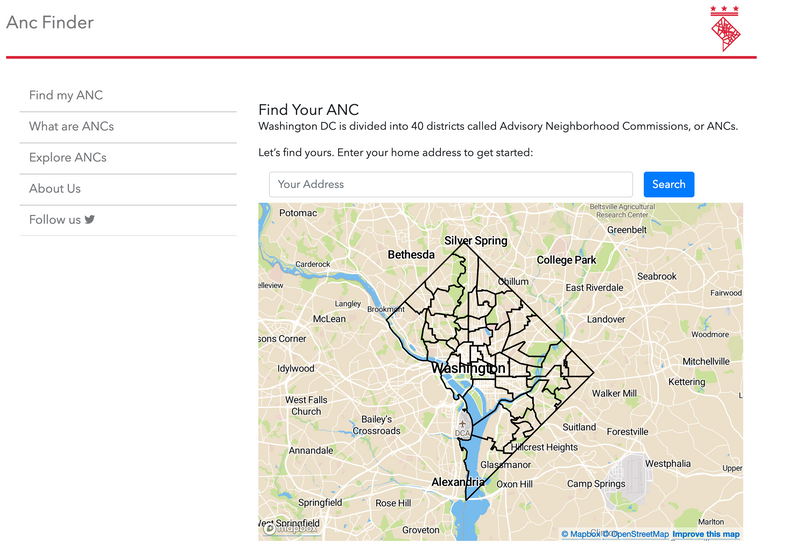
ANC Finder was a project to help residents of Washington, DC understand and engage with their Advisory Neighborhood Commissions (ANCs).
{% include components/project-card.html project=project %}
Latest Blog Post
The latest blog post component is used to highlight recent news. It automatically fetches the most recent post from the blog and displays its meta information, excerpt, and tags.
Latest from our Blog
Stay up to date with the latest news, project updates, and insights from the Civic Tech DC community.
{% include components/latest-blog-post.html %}
Generic Card
The generic card component is a flexible template used to display structured information. It accepts a custom class, header, body, and an optional image. It must be wrapped inside a usa-card-group element.
-
Custom Card Title
This is the card body text where you can describe any project or information.
{% include components/card.html
   class="usa-card grid-col-12 tablet:grid-col-6 desktop:grid-col-4"
   header="Custom Card Title"
   body="This is the card body text where you can describe any project or information."
%}
Positions List
The positions list component automatically retrieves and displays active volunteer listings defined inside our projects. It accepts an optional limit parameter to cap the number of items shown.
{% include components/positions-list.html limit=3 %}
Supporters Section
This component displays the logos and names of Civic Tech DC sponsors and supporting organizations.
Supporters
Civic Tech DC wouldn't be what it is without the generous support of these organizations!




Organizations like these power us through funding, event space, food, and compute. If your company or foundation wants to back free and open civic tech, we'd love to talk. Supporters are recognized on our website, at events, and across our community channels.
{% include components/supporters.html %}
Community Partners Section
This component displays the logos and names of partner organizations Civic Tech DC collaborates with.
Community Partners
Working together with these organizations to build technology for civic and social good.







Civic Tech DC runs on volunteer time and the organizations who back it. Whether you can support our work or build something alongside us, we'd love to hear from you.
{% include components/community-partners.html %}